A platform between commerce, local production and social impact.
SpirulinAfrica is a Belgian non-profit working with local African partners around spirulina production.
The project runs on an unusual model: promoting and selling spirulina to a European audience while supporting local production and programmes for African communities.
So the site had to do far more than sell a product.
It had to let people understand the project, meet the producers and farms, build trust, buy spirulina, support the programmes and grasp the human side behind the product.
Several intentions. One experience.
The main UX challenge came from how different the users and their goals were.
A visitor could arrive to:
Those intentions are very different. The challenge was to keep the site from looking either like a plain shop or like a non-profit page stuffed with information.
How do you bring commerce, transparency and social impact together without losing the user?
Discover → Understand → Trust → Act
I structured the experience around one simple progression.
That logic became the backbone of the whole experience.
The site is organised around several entry points:
plus the flows tied to the cart and the subscription.
The goal was not to give every page equal weight, but to let different profiles build their own path.
A consumer can head straight to the shop. Someone discovering the non-profit can instead go through the project, the farms and the programmes before considering a purchase or a donation.
What makes SpirulinAfrica different from a standard e-commerce site.
The design had to make that relationship clear without asking the user to read several pages before they understand the mission.
That is an information architecture problem, not just a UI one.
For a project that mixes product, commerce and non-profit commitment, trust is essential.
So I gave real space to everything that shows who produces, where and why — the farms became part of the experience rather than a footnote.
The Support Benin page is the clearest example: the goal, the amount already raised and the concrete results all come before any call to donate.
One important decision was not to reduce the user action to “buy”.
The experience offers several levels of involvement:
That keeps the commercial side without hiding the non-profit mission. The shop becomes one part of the ecosystem rather than its only purpose.
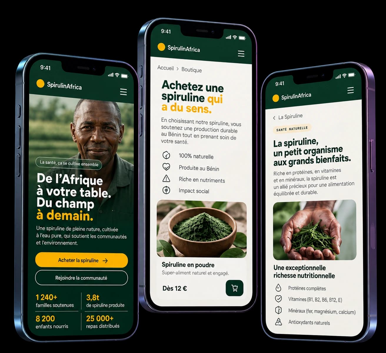
The mobile version had to keep that hierarchy in far less space.
The work focused on:
The mobile presentation covers 15 screens at 390 px, built up around the main journeys.
The visual identity connects two worlds: the natural and human side, and a contemporary digital experience.
The interface uses photography, colour and a clear type hierarchy to give more room to the content and to the people behind the project.
The goal was not a “humanitarian” aesthetic, but a platform credible enough to work at once as a showcase, an information space and a commercial experience.
One platform, several forms of involvement.
SpirulinAfrica was above all an information hierarchy problem.
The challenge was not just a shop that is pleasant to use, but making an ecosystem of producers, consumers, partners and local programmes understandable.
The solution rests on one simple principle:
Don’t start by asking the user to act. Give them the means to understand why they would.