Designing a space that turns an inspiration into an interior project
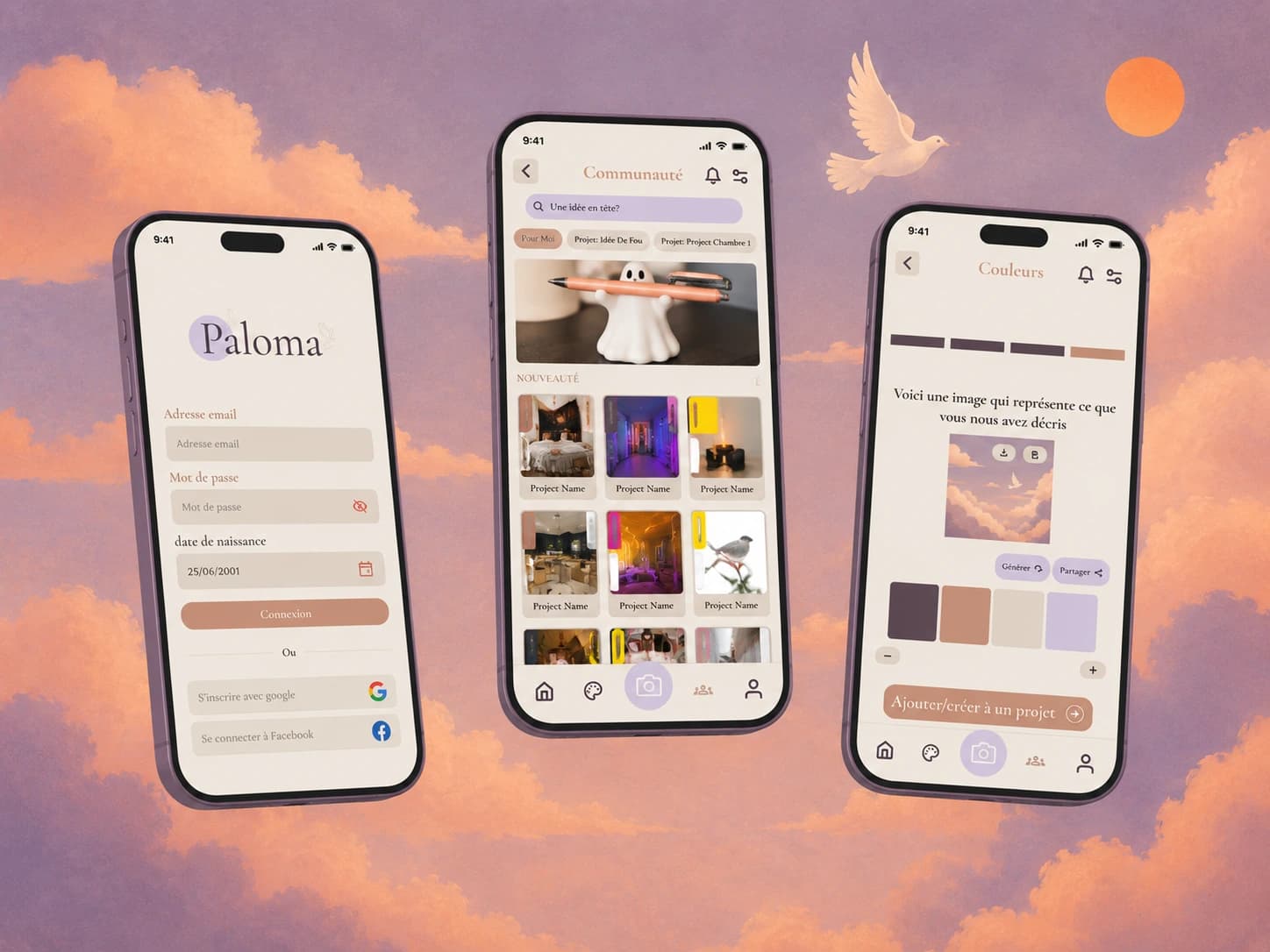
Paloma is the project I carried out for my final year, 2025–2026.
The idea was to design a platform that brings interior design inspiration together in one place, and moves the user gradually from inspiration to an actual project.
I treated it as a complete piece of UX thinking, from analysing the need all the way to the final prototype.
Inspiration is everywhere. The project is nowhere.
Interior design inspiration is scattered across specialised platforms, social networks, images, references and personal ideas.
The problems I identified were the spread of sources, the difficulty of picturing the final result, and important information getting lost along the way.
The main persona is Laura, 28, a community manager in Liège.
She is into interior design and DIY, and mainly wants to:
Her frustrations centre on the number of separate sources, tools that are too complex, and how hard it is to picture the finished result.
I studied several existing solutions, Pinterest and Houzz Pro in particular.
The analysis shows that some platforms answer part of the need very well, but that none of them bring together the whole set of features Paloma was meant to cover.
Houzz Pro offers advanced editing and design features, but its pricing was also a significant point of comparison in the analysis.
I then built a complete journey around Laura:
Each step was studied in terms of emotions, actions, frustrations and opportunities for improvement.
The goal was to move the user from a very open phase — looking for inspiration — to a much more concrete one: structuring, sharing and finalising their project.
Several directions were explored before converging on one solution.
The early wireframes were a way to test:
Three main directions were compared before settling on one that favours simple navigation, a single place for everything, and a coherent visual experience.
The prototype carries over the principles set during the earlier phases to build a coherent experience across inspiration, organisation and delivery.
It is probably the project that shows my full UX process best.
I did not start from the final interface.
I started by trying to understand who the user was, what they wanted to achieve, what was holding them back, and how to carry them through to their goal.
That logic is what drives the interface decisions that follow.