E-commerce site & catalogue for reclaimed wood
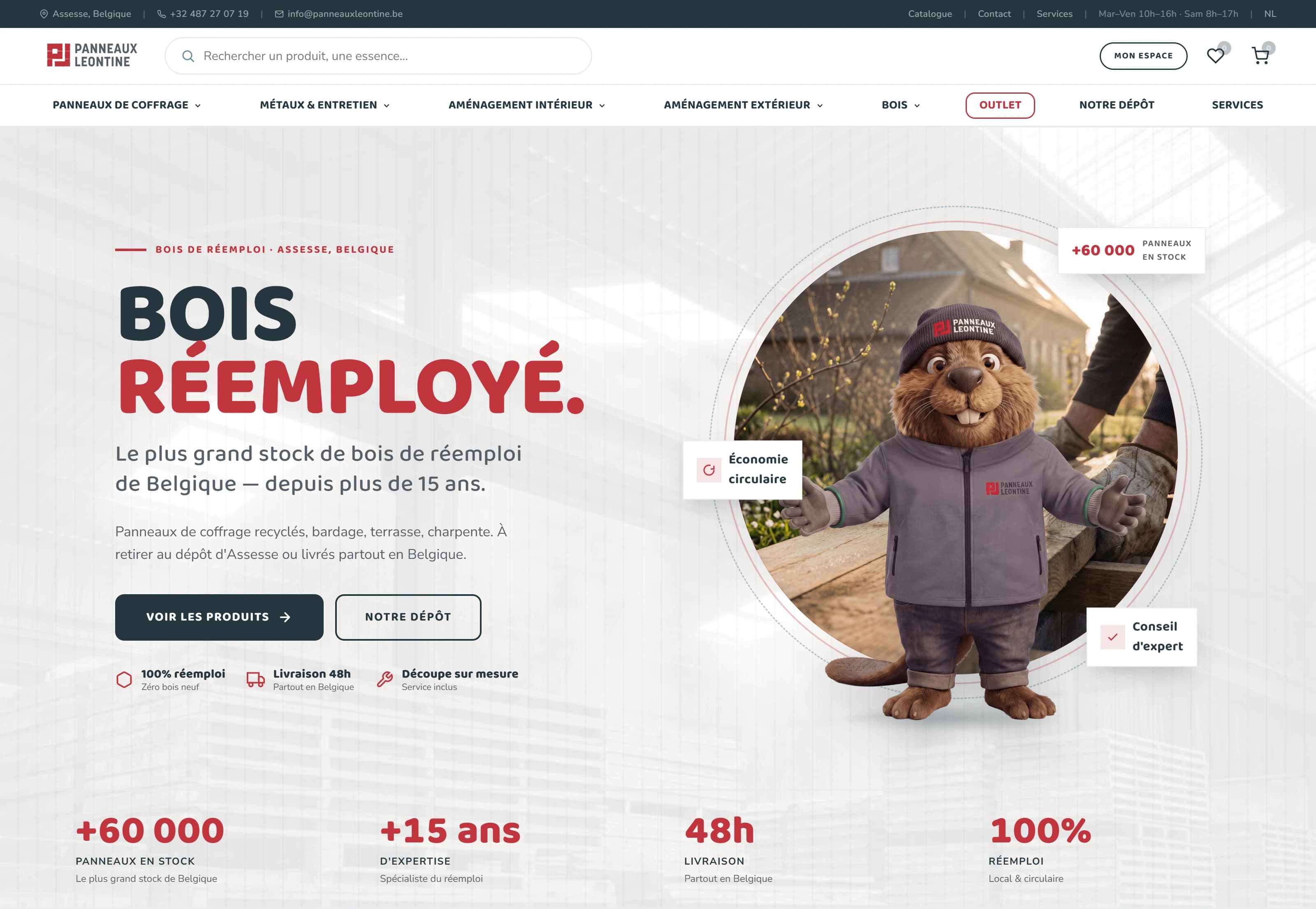
Panneaux Léontine specialises in reclaimed wood in Belgium. The project was to design an online presence able to present a large catalogue of materials while serving two audiences: private customers and professionals.
The site had to let people discover the different wood species, browse products, understand their characteristics and go all the way to an order or a quote request.
It includes a product catalogue, detailed product pages, a cart, a delivery and payment flow and a dedicated area for professionals. The catalogue now holds more than 60,000 available panels across several product families.
Stock that changes from one day to the next.
Panneaux Léontine works with reclaimed wood. Unlike a traditional catalogue, the available products are not standardised: stock depends directly on the panels that come in and their condition on arrival.
The same type of panel can therefore change condition overnight. A 200 × 200 × 4 cm panel may be available today in one condition, then be unavailable or show a different condition a few days later.
This is a serious problem for an e-commerce site: the image and the information shown must match the product actually available.
A panel’s condition also drives its price. Managing a simple stock quantity was not enough: the real condition, the visual and the price had to stay consistent with one another.
The other main challenge was making a large offer understandable and browsable, without losing the user in the sheer volume of products and information.
How do you build a dynamic catalogue for stock that, by nature, isn’t?
I had to design a logic that keeps a reliable match between:
so that no one orders a panel based on an image that no longer matches what is actually in the yard.
I worked around a structure that moves the visitor forward step by step:
Navigation combines two axes: usage-based worlds — indoor, outdoor, formwork, decking — and the material's own characteristics: species, thickness, finish, treatment and dimensions. A keyword search completes them, for visitors who already know what they are after.
Rather than splitting the audiences into two separate areas, every product shows prices with and without VAT side by side, with no account and no upfront choice. The professional mode is an option on top: it foregrounds quantities, discount tiers and bulk lots for those who need them.
The filter panel reconfigures itself around what is already checked. Across the whole catalogue it offers material and price; step inside the boards and material — now pointless — gives way to thickness, finish, treatment and dimensions. Every box carries the exact number of products it would return, so no combination ever leads to an empty page.
The interface had to let stock be updated against the reality of the yard, rather than treating products as fixed references.
The goal was twofold:
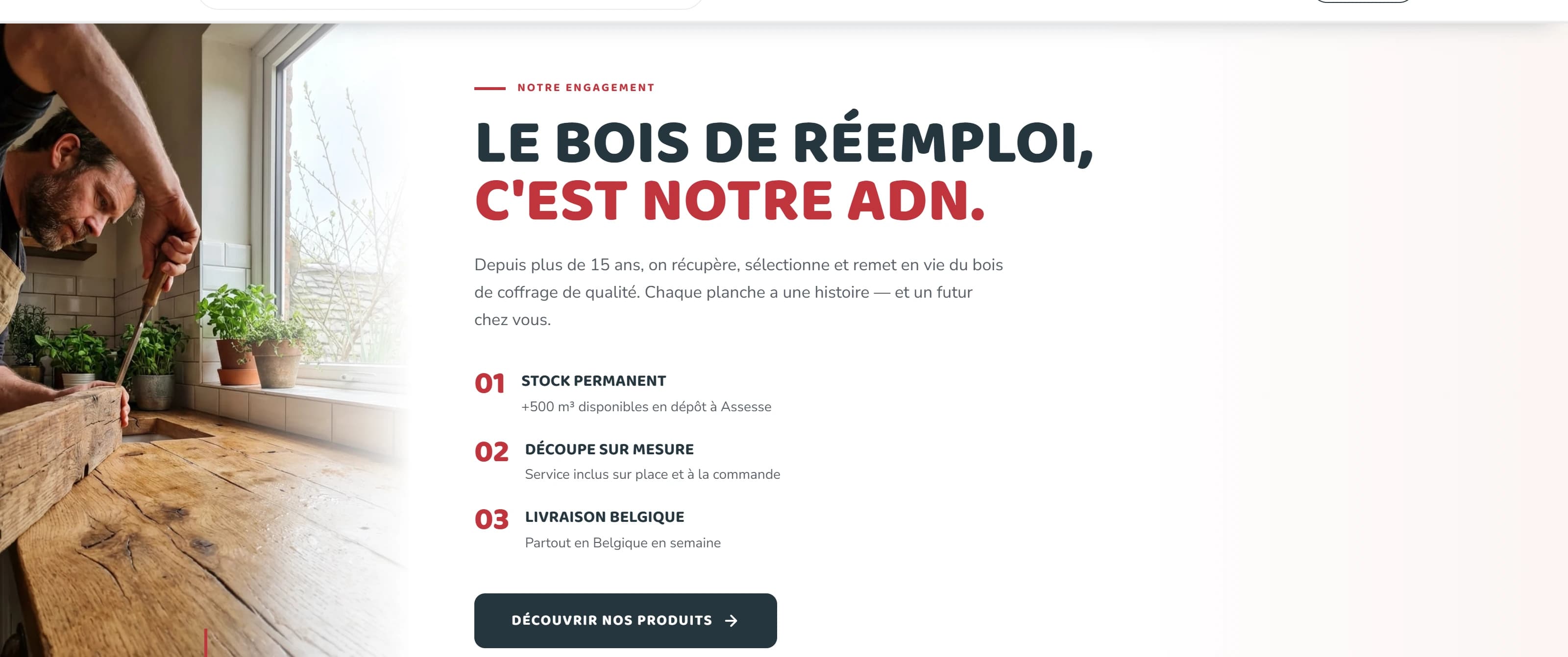
The result is an e-commerce site built from a few clear blocks:
This project taught me to think about architecture before interface.
When there is a lot of content, an interface becomes confusing fast. My work was to organise the information so the user always knows where they are, what they can do and what the next step is.